Public Brand Guide
Introducing the new Statflo brand
A new look that matches the way we feel
Disclaimer
This guide will help you use our brand assets and trademarks, including our logo, the "Statflo" name, content and pictures without having to run through our marketing team every time. If you wish to do something that is not covered by these guidelines, please contact the Marketing Team with a description and mockup of your intended use.
Introduction
Updating the Statflo brand has been something we've been working on since closing our Series A round in May 2018. We wanted our look to match (1) the way we feel and (2) the extent our whole team cares about every customer.
The new look represents the type of company we want to be: one that pays attention to the details and builds solutions that always drive value. It also matches our desire to invest in quality, improve communication, create more consistent experiences and design features for the long term.
Statflo was founded to create the most compliant way to build warm, authentic customer relationships in retail.
This brand embodies this mission, and we are proud to be on it with you.
- Kevin Gervais, Co-Founder
The Story
The best brands stand for something. We wanted ours to reflect where we came from, why we exist, what we stand for, and who we are.
While we found our roots in data analysis, the Statflo name came to represent more over time. We were making data actionable, and closing the loop to see the results that came from partnering with us. As we built on this, we realized we were most passionate about one thing: transforming a retailer's relationship with their customers from cold to warm through human conversation.
It’s magical to think of the millions of connections our customers have been able to maintain last year because of what we do. It took multiple steps to make that possible, something that continually unfolds and is built on the scaffold of the right people and values.
By October 2018, we decided on a look that resonated with our story, and we began a 4-month process to make it part of our DNA and reveal it to some of our key customers and partners.
The transition to the new brand impacts everything we do, from how we measure and coach each other to how we design our products to how we communicate. We are so excited about where it will take us.
Logo Guide


Color Logo
This is the main Statflo logo to be used whenever possible. The inverted logo is only to be used on dark backgrounds or photos.
We call the symbol "The Journey", and it represents the journey every buyer takes - from cold to warm. Building warm relationships with customers is a constantly unfolding process that takes the right words, timing, compliance and frequent one-to-one interactions.
The symbol must always be accompanied by the Statflo work mark unless approved by our marketing team. The logo must always be in color and the warm part of the symbol must always be at the top.
Please do not modify the marks, rotate them, or combine them with other logos. Please contact the Marketing Team if you are unsure of how to use it or you require an alternate version.
Logo Spacing & Margins
The logo mark must always have the correct spacing around it, equal to one of the squares of the "S" on all sides.
Use of Our Logo
For questions on using this logo consult with our Marketing Team.
Primary Logo Colors

#E21D7A
Pantone 213 C
227/30/122

#AF2185
Pantone 241 C
175/32/133

#293A89
Pantone 2147 C
41/56/138

#158EB2
Pantone 7459 C
23/142/178

#3DB8C0
Pantone 631 C
62/184/193
Background Colors

#051C2C
Pantone 296 C
5/28/44

#FFFFFF
0/0/0

#FFFFFF
255/255/255
Our Colors
Avoid deviating from these colors or creating tints of these values unless approved by our Marketing team.
“Primary" colors act as key colors in illustrations, icons and key titles, but should follow the mood of what is being said. Positive colors are magenta, negative colors are blue. A relationship that is healthy, or a great conversation is warm. A relationship that is dying, or "spray and pray" marketing is cold. Something that was warm can become cold if the wrong message is sent or too much time passes.
Use the "Background" colors as backdrops.
Typography
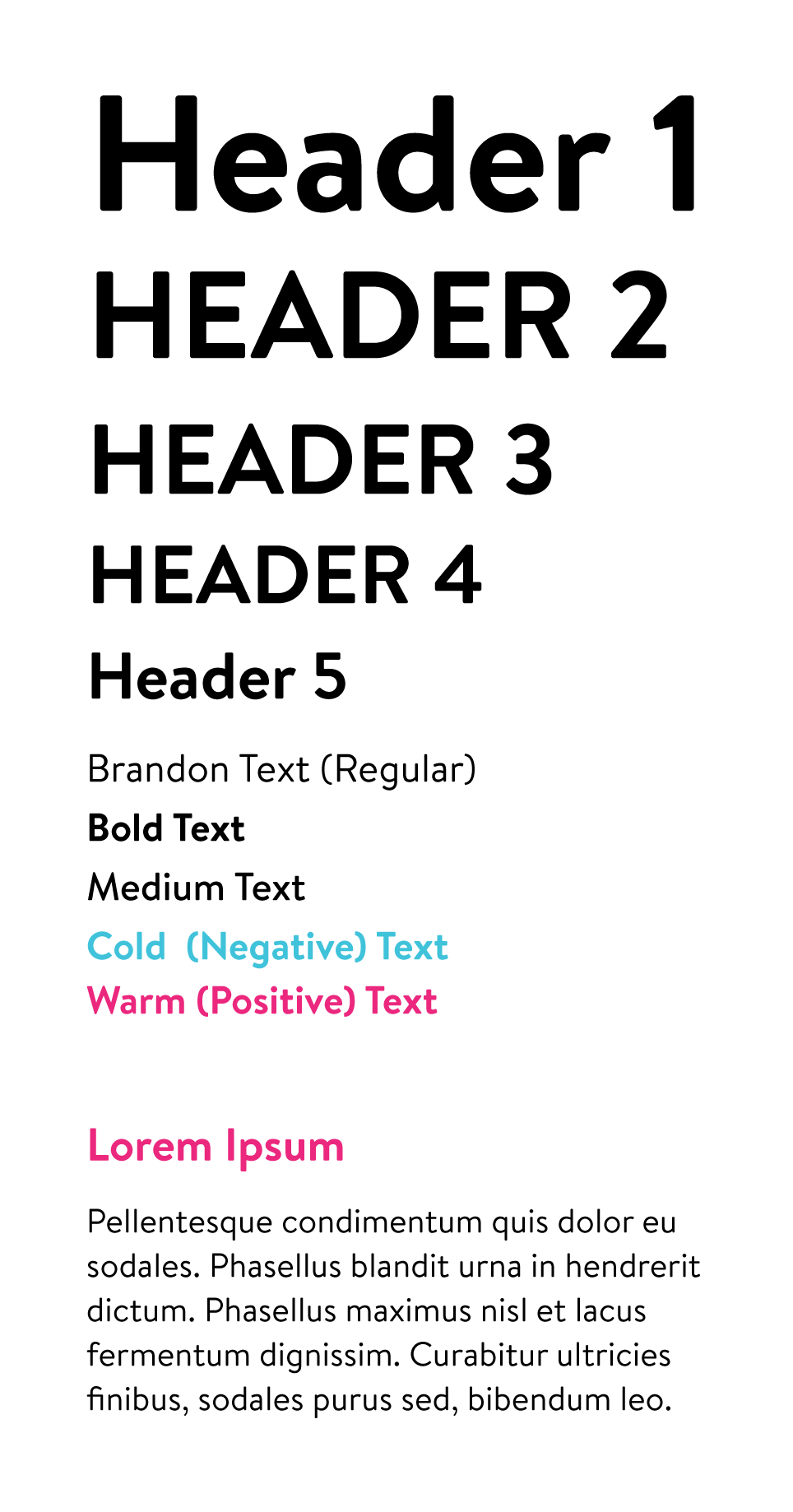
Brandon Text
All branded materials should use the official font, Brandon Text, which can be purchased via MyFonts. Always typeset it with Optical kerning, set the tracking to 0, and set in title case or sentence case (as determined by the content). Headings are mainly 40% larger font size than Body Text. Line spacing of Body Text is usually 1.15.
Subtitles should be in all-caps. Do not set in all-lowercase anywhere.

Our Brand Personality
We love people
We believe in human relationships, not just between retailers and their customers but also the way we build relationships with our customers. It also means showing strong empathy for every person touched by what we create.
It's about data & results
Data drives everything we do, as well as the insight we have from millions of conversations and the audited results of what we delivered for our customers.
Authentically Caffeinated
Our energy is contagious – we’re eternally positive, hopeful and optimistic, while still being authentic. We're motivated by the engagement we get from front-line staff and the conversations we helped create, and that moves us to do even more.
Standing for Something
We saw the "retail renaissance" coming six years ago, and our founders have been in the "SMS for business" space since 2008. We have an opinion on where retail relationships are heading and will share this vision with the world.
Complete Brand Identity Guide
Request the complete brand identity guide from our marketing team, including stock photography, icon packs and more!